Research
A2P-Vis: an Analyzer-to-Presenter Agentic Pipeline for Visual Insights Generation and Reporting
A2P-Vis: An Analyzer-to-Presenter Agentic Pipeline for Visual Insights Generation and Reporting Overview Research area: Machine learning / LLM-based multi-agent systems, data-science automation, and v
- arXiv
- 2512.22101
- Published
- 2025-12-26
- Authors
- Shuyu Gan, Renxiang Wang, James Mooney, Dongyeop Kang
AI summary
A2P-Vis: An Analyzer-to-Presenter Agentic Pipeline for Visual Insights Generation and ReportingOverview
- Research area: Machine learning / LLM-based multi-agent systems, data-science automation, and visual analytics (insight generation and automated report writing).
- Technical level: Intermediate — the paper is a system-design description with no mathematics or formal evaluation, but it assumes familiarity with LLM agents, prompting, and plotting pipelines.
- Scope: The paper describes A2P-Vis, a two-part multi-agent pipeline (a Data Analyzer and a Presenter) that converts a raw dataset into a quality-gated set of charts with scored insights and then into a coherent, publication-ready visualization report.
What This Paper Is About
Automating an end-to-end data-science workflow with AI agents still stalls on two problems: producing diverse visualizations that carry genuinely non-trivial insights, and assembling those materials into a coherent, professional report. A2P-Vis addresses both by splitting the work between an analyzer stage — which profiles the data, proposes visualization directions, executes plotting code, filters bad figures, and generates and scores candidate insights — and a presenter stage that turns the surviving charts and top-ranked insights into a readable narrative document. The goal is to remove the manual "glue work" between raw data and a finished visual report.
Key Contributions
- The Data Analyzer, a multi-agent module that profiles dataset metadata, proposes diverse visualization directions, generates and executes plotting code, filters low-quality charts, proposes candidate insights, and evaluates those insights with an integer scoring rubric.
- The Presenter, a multi-agent module that ranks topics into a coherent order, drafts an introduction, composes chart-grounded narrative sections with explicit transitions, summarizes key takeaways, and revises the assembled document for clarity and consistency.
- A quality-assurance design built around insight scoring and a chart-legibility/quality checker, framed as producing "verifiable insight (structure + rubric)," diverse visualization directions, and end-to-end reliability from raw data to narrative report.
- A working end-to-end artifact, including a publicly linked complete dataset report produced by the pipeline.
Main Findings
- Two persistent gaps are identified: (i) producing diverse, evidence-rich visualizations with non-trivial insights, and (ii) assembling these materials into a coherent, professional report.
- Design is motivated by human analyst behavior: the authors describe the pipeline as mimicking how data scientists inspect seed data and arrive at final insights through trial and error, picking the best among generated candidates.
- The Sniffer acts as a schema contract and quality gate: a compact metadata report (shape, column names, inferred types, sampled data, plausible analysis themes) is passed downstream instead of raw records, which the authors state reduces hallucinations and routine failures such as empty plots and degenerate scales, while lowering context cost.
- The Visualizer runs a four-step loop: direction generation (emitting topic, chart_type, and variables as machine-readable guidance), code generation, execution, and — on error — a rectifier that repairs the code strictly from the error trace before re-execution; each figure then passes a chart judger that checks for meaningless charts.
- Insights follow a fixed three-sentence template: (1) an observation with chart evidence and an approximate effect size, (2) a hedged, plausible reason anchored in chart or domain context, and (3) a "so what" delivering a concrete next step, a short-horizon prediction, or a precise implication.
- Insight scoring uses four criteria: Correctness & Factuality, Specificity & Traceability, Insightfulness & Depth, and "So what" Quality. The evaluator ranks candidates by total score and returns the top 3 per chart. The abstract, as printed, lists "depth, correctness, specificity, depth and actionability" for the scoring dimensions.
- Insight volume per chart: the Insight Generator produces 5–7 candidate insights for each quality-gated figure.
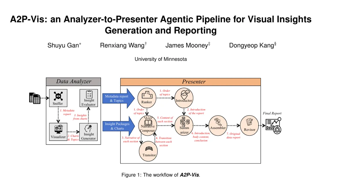
- The Presenter follows an overview → sections → summary sequence, implemented by named agents: a Ranker (orders topics by shared variables, temporal order, or thematic similarity), an Introductor (dataset properties plus one–two sentence teasers per topic), a Narrative Composer and Transitor (claim → evidence → implication subsections plus one or two bridge sentences connecting to the next section), a Summarizer, an Assembler (Markdown report with heading hierarchy, embedded figures with captions, date, headers, footers, page numbers), and a Revisor (multi-pass chain-of-thought-style revision).
- No quantitative evaluation is reported: the paper contains no benchmarks, no dataset sizes, no accuracy or quality metrics, and no user study comparing A2P-Vis against baselines. The only concrete example given is the demonstration on "a real dataset" shown in Figure 1 and the linked complete dataset report.
Methodology in Plain English
The authors build the system as a sequence of specialized LLM-driven agents rather than one monolithic model.
First, a Sniffer looks at the raw table, records its shape, column names, and inferred types, samples some rows, and writes a short metadata report plus plausible analysis themes. Everything downstream reads this compact profile instead of the full dataset, which keeps the model's context small and gives later agents a stable, valid view of the columns to work with.
Second, a Visualizer turns that profile into figures. A direction generator proposes concrete analysis topics and, for each, a machine-readable specification of the topic, chart type, and variables. A code generator compiles each specification into an executable script. An executor runs the script; if it fails, a rectifier fixes the code using the error trace and tries again. Each resulting figure is then checked one by one by a chart judger that rejects meaningless charts.
Third, an Insight Generator writes 5–7 candidate takeaways per surviving figure using the three-sentence observation/reason/so-what template. An Insight Evaluator scores each candidate on the four-criterion integer rubric, ranks them, and keeps the top 3 per chart.
The Presenter then takes over. A Ranker decides what order the topics should appear in. An Introductor writes the opening and previews each topic. A Narrative Composer turns the top insights for each chart into a subsection that cites the figure, preserves approximate magnitudes and axis references, and follows a claim-evidence-implication pattern, with a Transitor adding bridge sentences to the next section. A Summarizer writes the executive summary and closing conclusions, an Assembler compiles everything into a formatted Markdown report with embedded figures, and a Revisor does a multi-pass revision for structure, transitions, wording, and style.
Why This Matters
The paper targets the last mile of automated data analysis: not just generating a chart or a statistic, but producing a curated, defensible, and readable report. By pairing a scored, quality-gated analysis stage with a dedicated writing stage, it treats "co-analysis" between humans and automated systems as an end-to-end design problem rather than a collection of disconnected capabilities.
Real-world applications:
- Automated first-pass exploratory data analysis, where an analyst receives a drafted report with candidate insights and charts to accept, reject, or refine.
- Business and operational reporting pipelines that need regular chart-grounded narratives from recurring datasets.
- Scientific or institutional data documentation, where a dataset's properties and main patterns must be summarized for non-specialist readers.
- Educational settings, where the pipeline can demonstrate how charts, evidence, and implications are connected in professional analysis.
Industry relevance: the framing around verifiable, rubric-scored insights and machine-readable visualization specifications speaks directly to organizations deploying LLM agents in data workflows, where hallucinated columns, broken plotting code, and unusable figures are routine failure modes. The Sniffer-as-schema-contract and rectifier-on-error design patterns are practical engineering responses to those failures.
Future Directions
- Empirical validation: the paper reports no benchmarks, no dataset size, no baseline comparison, and no user study; establishing metrics for insight quality, chart diversity, and report coherence is the most obvious open need.
- Scaling the reported demonstration: the pipeline is illustrated on a single real dataset with a linked full report; how it behaves across heterogeneous schemas, wide or multi-table data, and time-series or geospatial data is not addressed.
- Rubric reliability: the four-criterion integer scoring is done by an evaluator agent; whether that scoring correlates with human expert judgment on correctness and insightfulness remains an open question.
- Human-in-the-loop control: the current design is described as end-to-end without manual glue work; where reviewers should intervene — direction selection, insight filtering, ordering, or final revision — is not explored.
Target Audience
Researchers and practitioners working on LLM-based agents, automated data science, and visual analytics will benefit most, along with visualization and HCI researchers interested in how insights are selected, scored, and narrated. Data scientists and engineers evaluating agentic pipelines for automated reporting will find the modular agent decomposition and the failure-handling patterns (schema contract, code rectification, chart judging) directly applicable. Readers looking for quantitative evidence of improvement over existing systems will find that this paper does not provide it.
Authors’ abstract
Automating end-to-end data science pipeline with AI agents still stalls on two gaps: generating insightful, diverse visual evidence and assembling it into a coherent, professional report. We present A2P-Vis, a two-part, multi-agent pipeline that turns raw datasets into a high-quality data-visualization report. The Data Analyzer orchestrates profiling, proposes diverse visualization directions, generates and executes plotting code, filters low-quality figures with a legibility checker, and elicits candidate insights that are automatically scored for depth, correctness, specificity, depth and actionability. The Presenter then orders topics, composes chart-grounded narratives from the top-ranked insights, writes justified transitions, and revises the document for clarity and consistency, yielding a coherent, publication-ready report. Together, these agents convert raw data into curated materials (charts + vetted insights) and into a readable narrative without manual glue work. We claim that by coupling a quality-assured Analyzer with a narrative Presenter, A2P-Vis operationalizes co-analysis end-to-end, improving the real-world usefulness of automated data analysis for practitioners. For the complete dataset report, please see: https://www.visagent.org/api/output/f2a3486d-2c3b-4825-98d4-5af25a819f56.